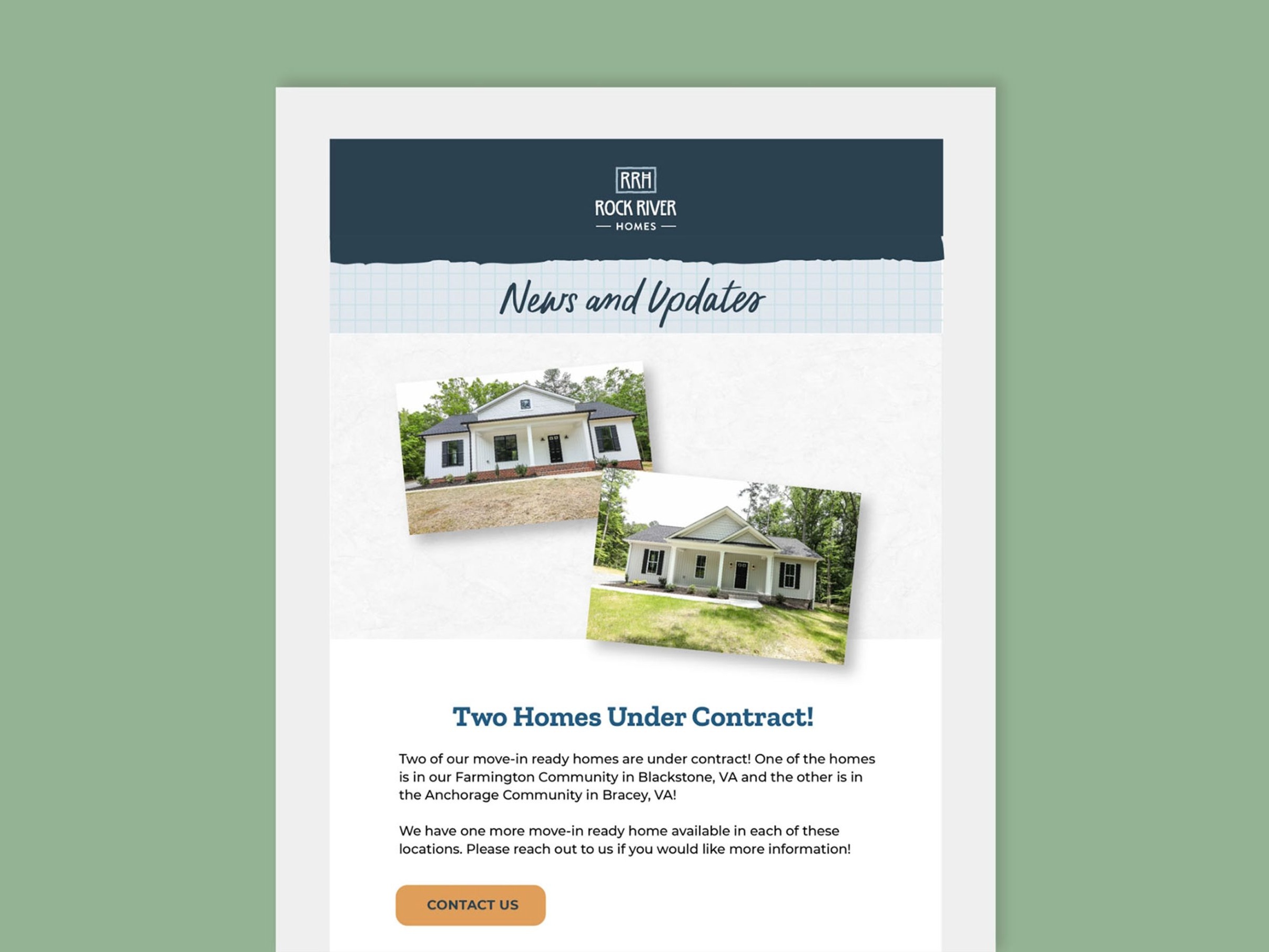
Website
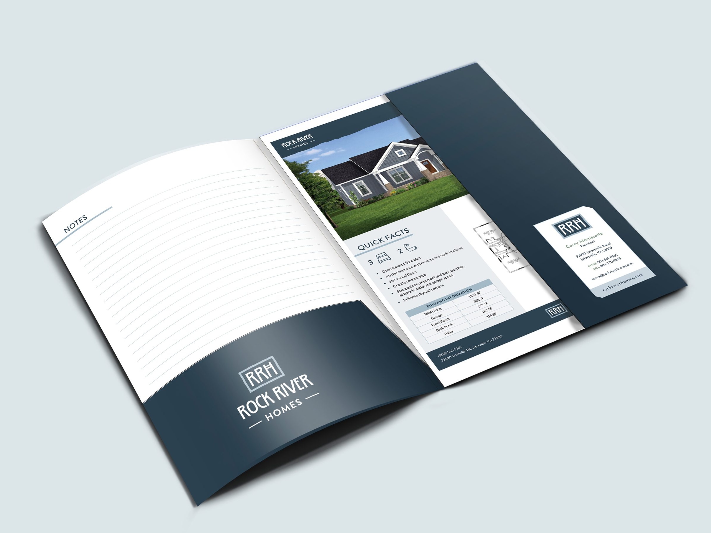
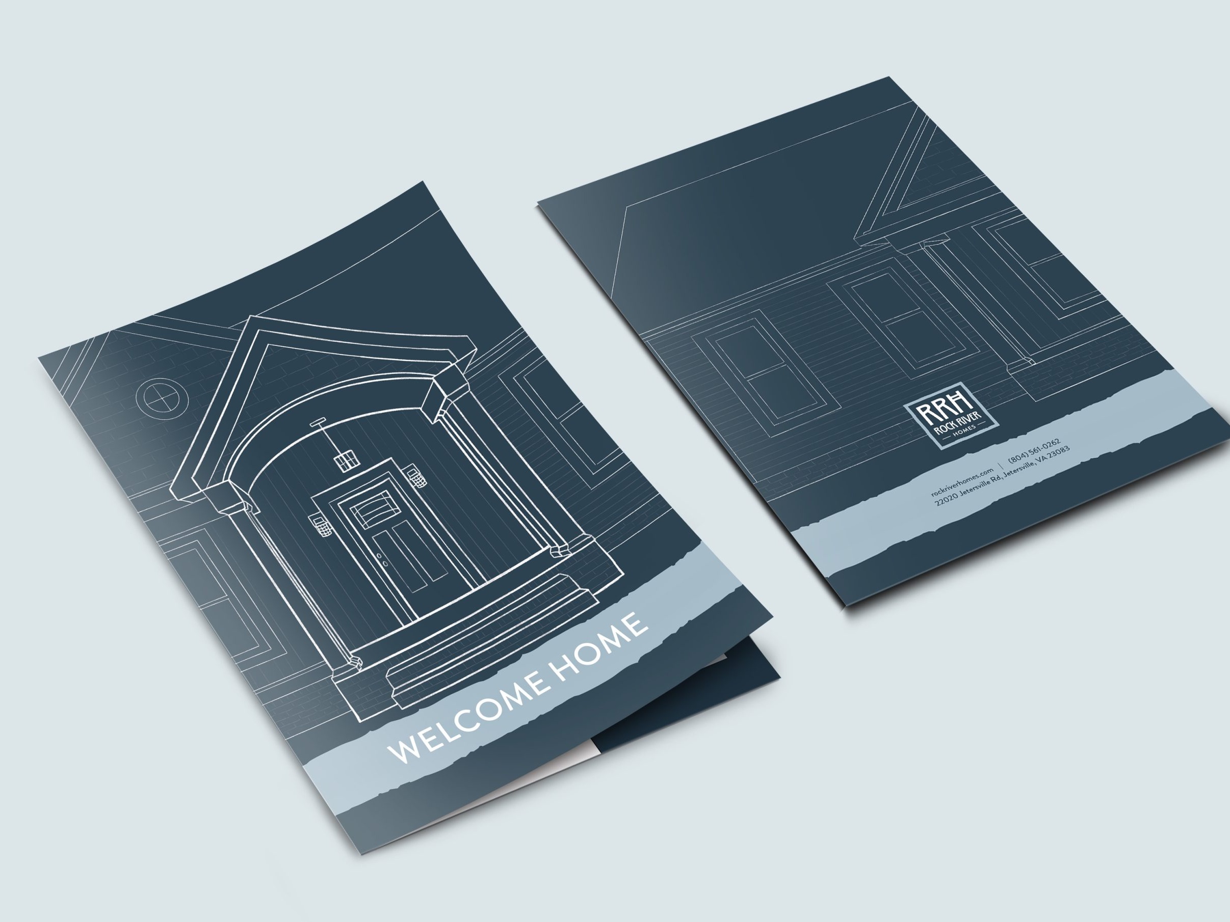
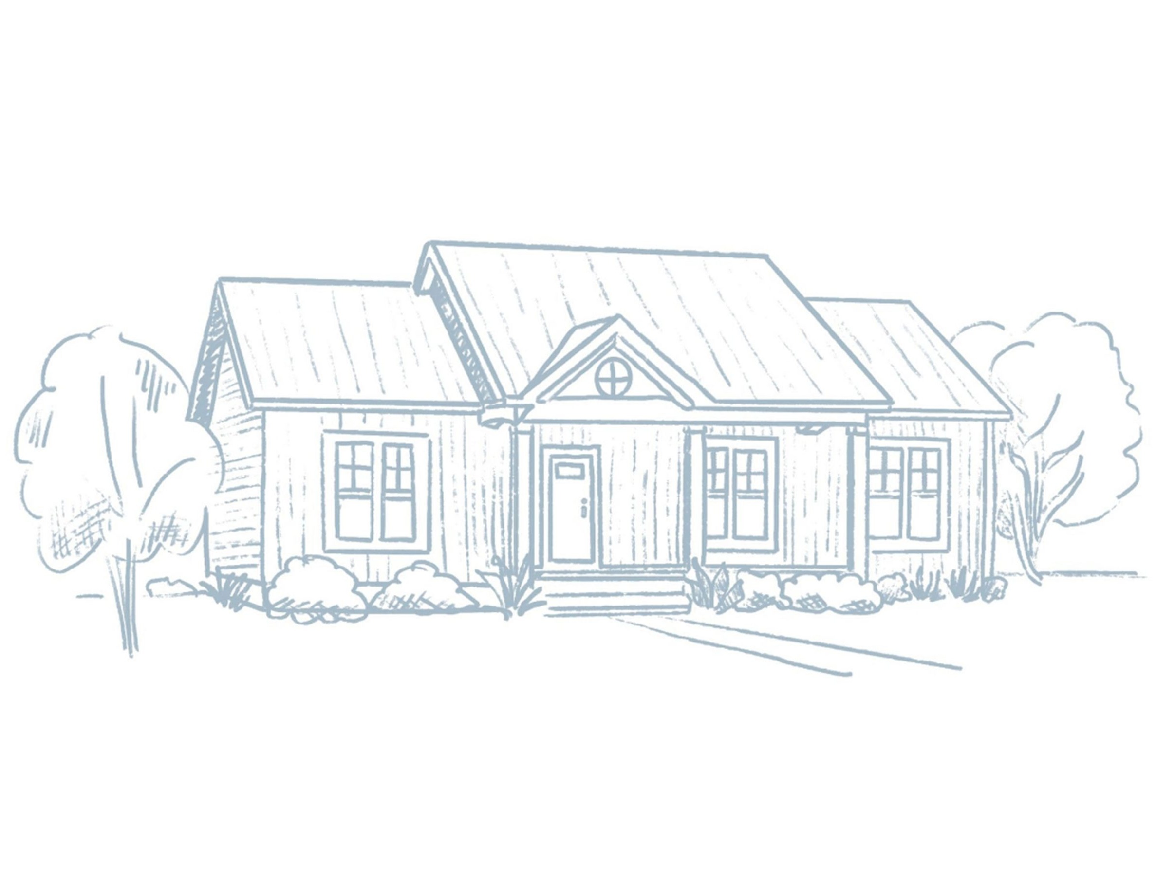
Rock River Homes Branding
The Rock River Homes branding strikes a balance between rustic charm and modern simplicity—reflecting the company’s roots in quality craftsmanship and approachable homebuilding. The logo and visual elements convey strength, stability, and warmth, using clean lines and a grounded color palette inspired by natural materials. The result is a cohesive identity that feels both trustworthy and down-to-earth, reinforcing the brand’s promise of making homebuilding a personal and accessible experience.
* The project was created in partnership with Red Orange Studio and was a result of collaboration with other team members.