Website
Sandbox Website
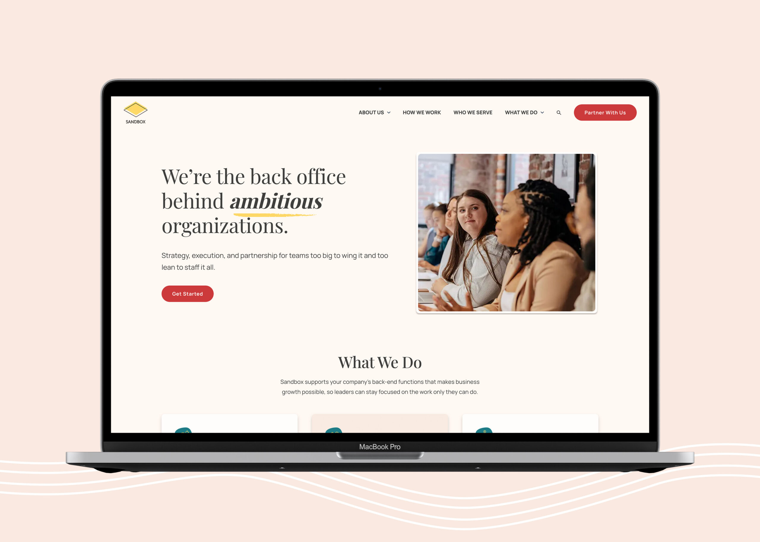
Sandbox had outgrown both its existing Squarespace website and the limited visual identity it was built around. Beyond their logo, the brand relied on a primary-heavy color palette with little tonal variation, and lacked a cohesive typography system, graphic language, or broader design system to tie everything together.
As part of the website redesign, I expanded Sandbox’s visual identity into a more complete and flexible system—introducing a more nuanced color palette, new typography, graphic elements, and design patterns that could bring personality to the brand while still supporting a clear, intuitive digital experience. Those elements became the foundation for a website that feels polished and established without losing the energy and approachability of the organization.
The result is a dramatic shift from a site that felt like an early-stage startup to a digital presence that better reflects the organization Sandbox has become: confident, credible, creative, and distinctly their own.
* The project was created in partnership with Red Orange Studio and was a result of collaboration with other team members.