Website
Sentara Foundation Website
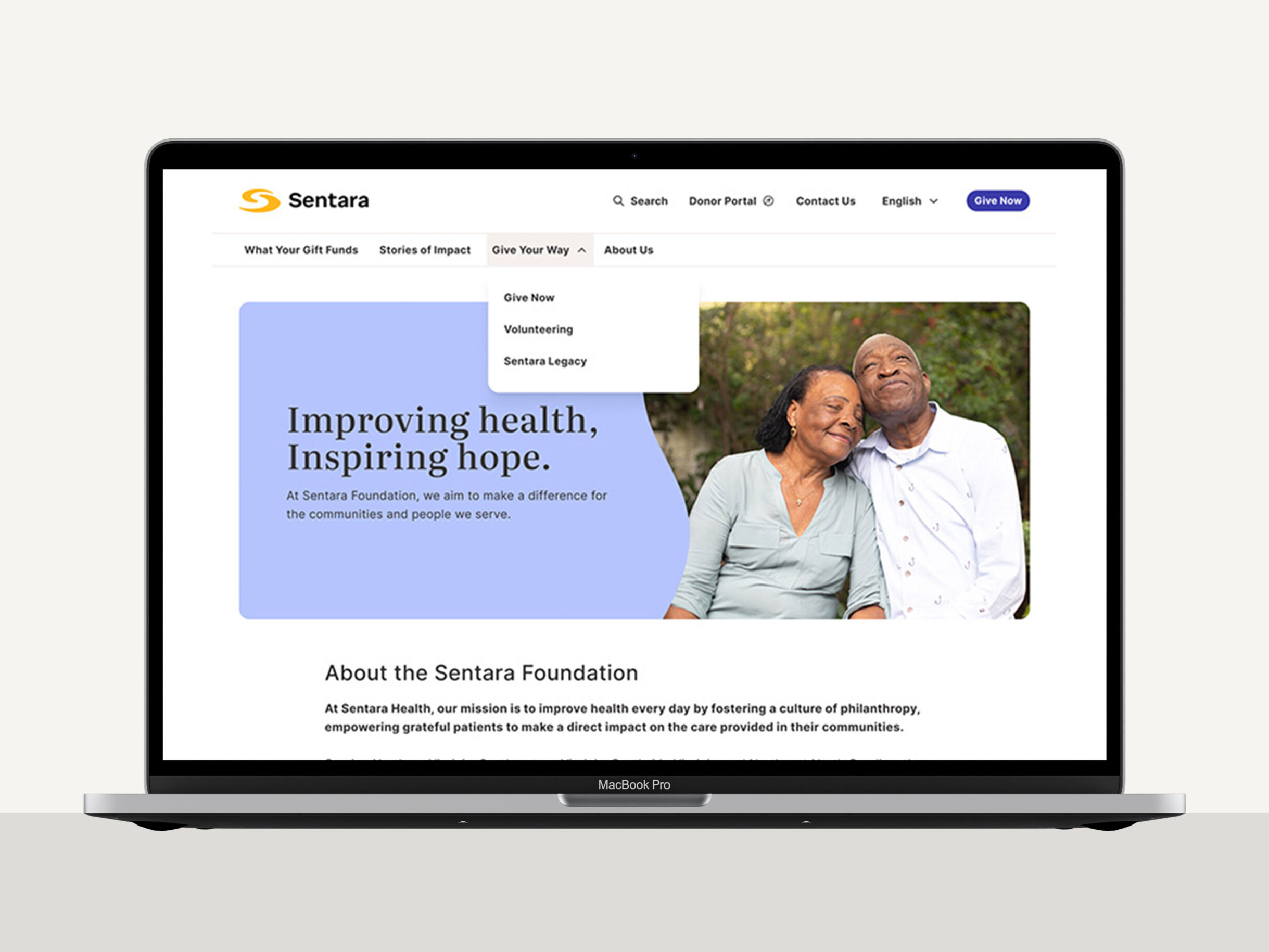
The Sentara Foundation website was designed during a larger evolution of the Sentara brand. We began the project before the new standards were fully established, developing an initial visual direction around the Foundation’s distinct audiences, content, and goals.
As Sentara’s broader design system began taking shape, our work needed to evolve with it. The challenge was to preserve the experience we had created while bringing it into alignment with an emerging enterprise system—without losing the warmth and individuality the Foundation needed to connect with donors and communities.
* The project was created in partnership with Red Orange Studio and was a result of collaboration with other team members.
Role
UX Strategy
UX/UI Design
Design Systems
Design QA
Collaboration
Content Strategist
Client Brand Manager
Developer
Tools
Figma
WordPress
Focus
Enterprise Design Systems
Component-Level Thinking
Accessibility
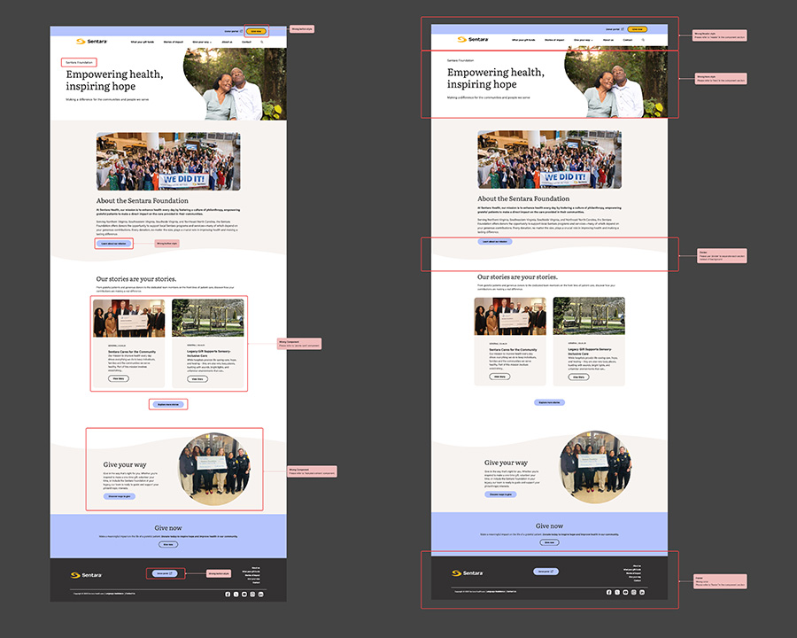
Balancing Consistency and Flexibility
I worked closely with Sentara’s Brand Manager to understand the intent behind the new standards and determine how they should translate to the Foundation. Unlike some experiences within the Sentara ecosystem, the Foundation was intentionally given greater flexibility to establish its own visual expression.
Together, we refined typography, color, hierarchy, imagery, and UI patterns to create consistency with the larger Sentara brand while maintaining a distinct identity for the Foundation. Responsive behavior, accessibility, and usability remained core considerations as we reconciled the two visual directions.
Building a Reusable UI System
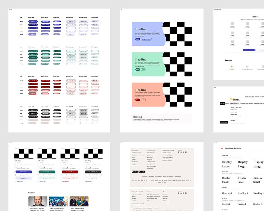
Rather than designing individual pages in isolation, I approached the experience with component-level thinking—working within Sentara’s established design system and applying its visual standards and UI patterns to the Foundation experience. Typography, calls to action, cards, navigation, and other interface patterns were used consistently across different content needs and screen sizes.
The challenge was knowing how to apply those established rules while making thoughtful use of the flexibility afforded to the Foundation. This allowed us to create a cohesive, responsive experience that supported storytelling, communicated impact, and guided users toward giving while remaining consistent with the larger Sentara digital ecosystem.
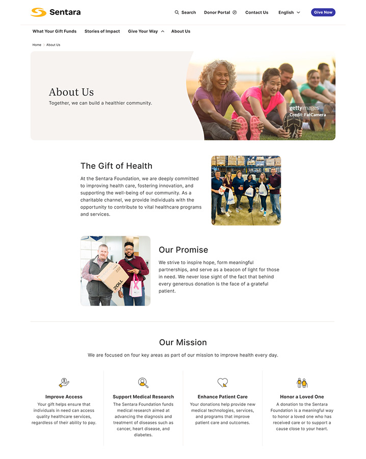
From Design System to Digital Experience
I collaborated closely with my developer throughout design and implementation, reviewing responsive behavior, working through technical constraints, and conducting design QA to maintain consistency between the approved designs and the final experience.
The result is a responsive, accessible website with a distinct identity that remains connected to the larger Sentara ecosystem. The project required more than applying brand standards—it required interpreting an evolving enterprise system, understanding where consistency mattered, and knowing where flexibility could create a stronger experience.